Why Zillow?
Market Leader
Zillow’s popularity gave us a chance to improve a tool millions depend on.

Familiar Yet Frustrating
Users know the app, but often find it cluttered and confusing.

High-Stakes Use Case
Renting a home is a major decision, so clarity is critical.

Improvement Potential
We found clear gaps in usability, making it ideal for redesign.

Zillow – Simplifying the Search for Home
When your dream home is one click away… but you can't figure out how to get there.
6 Members
My Role: Product Owner
UX Research & Interaction Design
5 Weeks

A usability redesign of Zillow's mobile app to streamline search, filters, and saved listings for renters navigating high-stakes housing decisions.

Zillow is a real estate platform that helps users search, rent, buy, and sell homes.
Problem Space
To uncover usability issues with Zillow’s in-app rental experience and explore design solutions that help users search smarter, save confidently, and navigate with ease.
Our Design Goals
1
Can users search intuitively on Zillow mobile?
Search Experience
2
Do filters feel clear, flexible, and trustworthy?
Filter Usability
Are saved homes/searches easy to find and use?
Infromation Architecture
3
4
What unmet needs do young renters experience?
User Research
Research Approach
Comprehensive methodology to understand user behavior and pain points
A screener survey is a short questionnaire used to identify and recruit participants who match the target user profile for a study. It helps ensure that the insights gathered are relevant and representative of real user behavior.
Demographics Profile
Zillow Usage
Devices & Comfort Level
Search Patterns & Behavior
Filter Usage
Users familiar with the area
Users actively looking for rentals
Mobile App Users
Currently renting / lease ending soon
Familiar with Zillow/ Real estate apps


Screener Survey
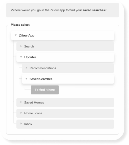
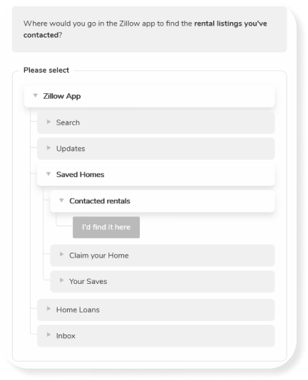
Tree Testing
We conducted a tree test to evaluate how well users understood Zillow’s navigation, specifically whether they could find “Saved Searches,” interpret the “Updates” label, and return to saved listings with ease.

Misinterpreted “Updates”
Many users expected saved content under the wrong tab.

Preferred Clearer Labels
Participants suggested terms like “Saved Searches” or “Favorites.”

Simple Renaming = Big Impact
Changing labels improves clarity and reduces navigation errors.
We conducted usability testing with 7 participants across 3 core tasks, focusing on search behavior, filter usage, and saving listings
With a 72% completion rate, the sessions revealed key usability gaps in Zillow’s navigation, filter clarity, and saved search flow.


Users struggled with unclear filters, hidden features like the Draw tool, hard-to-find saved searches, and an overwhelming list of amenities.
Usability Testing
Struggles
Likes
Needs
Behaviour


We synthesized 175 user data points through affinitization, grouping insights into struggles, likes, needs, and behaviors to uncover key patterns and design opportunities..

175 Data Points
Affinitization
Key Insights
Filters were hard to find
Saved listings felt disorganized
Navigation labels were misleading
"Draw Tool" was underutilized
Map experience felt overwhelming
How might we redesign Zillow’s saved items, filters, and navigation structure to help users easily find, organize, and control their home search experience?

Redesign the Saved Items System
Make saved homes and searches more visual and organized using folders or tags.


Revamp Filters for Discoverability and Control
Simplify filter UI and add exclusion options for better customization.
Rethink Navigation Labels
Rename and restructure misleading tabs in the navigation.

Solution 2
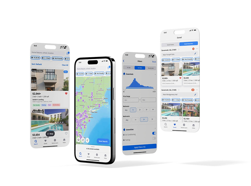
Redesign the Saved Items System


Users can now toggle between their Saved Homes and Saved Searches.
Saved Homes
Saved searches
Mark all as viewed
Improved listing cards with clearer details and an intuitive heart icon.

$2,800+
3 bds | 2.5 ba | 1,360 sqft
1016 E Anderson St #A, ...
$2,800
3 bds | 2.5 ba | 1,360 sqft
1016 E Anderson St #A, ...
Search
Saved
Home Loans
Inbox
Saved Homes
Updates
Home Loans
Inbox
Search
Moved Saved Searches under 'Saved'
Selected Filters now shown below each search instead of in the title.
For Rent, $4,500 or less, 3+ Beds, 2+ Baths, A/C,...
$1.2K-3K
2 - 3 bed
Pet-Friendly
Solution 1
Rethink Navigation Labels
Saved Homes
Updates
Home Loans
Inbox
Search
Search
Saved
Home Loans
Inbox
Combined Saved Homes and Searches under 'Saved'
Removed 'Updates' from the navigation menu.

4,143,rentals available
Search
Saved
Home Loans
Inbox
9:41
$1.2K-3K/mo
2 - 3 bd
Pet-Friendly
2+ bath

$1k/mo to $2.2k/mo
$1.2K-3K/mo
Simplified and concise filter names for improved clarity
Save Search
2 - 3 bd
2 to 3 bedrooms
Removed the save search icon and simplified the call-to-action for clarity.

Savannah, GA, 31401
For Rent near 31401
Added an Overflow Menu to provide additional options for saved searches
Solution 3
Revamp Filters for Organization & Discoverability

Amenities
Air Conditioning
Parking
Pet Friendly
In-Unit Laundry
Gym/Fitness Center
Replaced checkboxes with toggles to make the interface more intuitive
Grouped filters under clear categories with icons and made them collapsible
Exclude
Swimming Pool
Smoking
Added an “Exclude” category to let users filter out unwanted listings.
CTA now clearly displays the number of filters selected
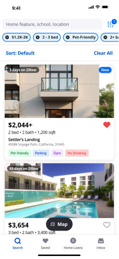
$2,044+
2 bed • 2 bath • 1,200 sqft
Settler’s Landing
45086 Voyage Path, California, 31045
$2,044+
$2,044+ 2 bds
Settler’s Landing - 45086 Voyage Path, California, 310...
Apartments for rent
Added an option to tag listings with labels
Repositioned the “Heart” icon for better visibility
Added visible filter tags on listings for quick reference
+ Navigation Clarity
Clearer labels like “Saved” reduced misclicks and hesitation.
+ Task Efficiency
Real-time tag previews and organized filters sped up search completion.
- Cognitive Load
Collapsible filter sections improved scannability and reduced scrolling.
- Errors
Fewer back-and-forth actions and confusion about saved searches.
Impact
Redesign delivered clear, quantifiable gains in usability and efficiency.
Future Considerations
Adressing other priority issues
Improve Map Draw Tool
Enable Comparison for Saved Homes
Introduce Onboarding & Contextual Help
Team: Aarushi Pohnerkar | Jordan McMorris | Keerthi Ginuga | Navyaa Taneja | Qi Luo | Hazel Do
Our redesign streamlined Zillow’s mobile rental experience, making navigation clearer, filters easier to use, and saved content more accessible. By aligning the interface with user expectations, we reduced friction, improved task speed, and gave users greater confidence in their search journey.

Zillow Client Magazine