SeaLove Candle Bar - Website Redesign
Creating a seamless, intuitive, and calming booking and shopping experience for a DIY candle bar.

4 Members
My Role: UX Writing & UI Design
10 Weeks

A strategic redesign of Sea Love’s website, focused on improving Information Architecture and UI to create a seamless, intuitive shopping and booking experience.
See How We Transformed Sea Love’s Digital Journey


#1C1C1C
#222637
#5E6A45
#E6D7B9
#F8F3EA
/Color Guide

Heading
Regular
44 pt
Body
Regular
16 pt
Heading
Regular
44 pt
Body
Regular
16 pt
/Text Style
SF PRO
EB Garamond
Creating Clarity from Chaos
The Challenge?
Despite a beautiful aesthetic, Sea Love's website was confusing to navigate, overwhelming in content, and lacked a seamless way to book workshops or explore products.


The Images are clickable but take you back to the same screen

Inconsistent Logos
Inconsistent Navigation

Confusing Selection of Date
Looks like selecting a range of date
No difference between experiences and events
Crowded Navigation Bar

Repeated content making the page too long
Will open a different page when you click on it.
Align digital experience with calming, minimal vibe
Reduce drop-offs during booking
Improve findability of products and services
How did we transform?


High-end
Organic
Conventional
Affordable


We Researched
“
”
Finding the products on the website was hard at first because the button was too small and unclear, but once I found it, I could see all the collections easily.
“
”
I buy candles frequently, usually as gifts or just for myself. I look for scents that match my preferences, and the packaging design and price are important too.
We host events such as bachelorette parties, date nights, birthdays, and more. Our customers vary in age, from children to adults, with the majority being women.
“
”
We Interviewed
“
”
I initially liked the website for its clean, minimalistic design, but as I explored more, I found it overwhelming and poorly organized with too much information.


We Designed


We Card Sorted


We Tree Tested


We Rewrote UX Writing


We Tested Again
First, We untangled the Mess!

Transformation Summary
1
Simplified Navigation
From 6+ scattered categories to clear, purpose-driven sections that users can easily understand
2
Integrated Experience
Booking system integrated directly into the main site, eliminating external redirects and user drop-offs
Logical Organization
Footer restructured into intuitive groupings that help users find information quickly and confidently
3

Reorganized the homepage around user actions: Shop, Create, and Explore, reducing decision fatigue.
Hero section redesigned with simplified messaging and clear CTAs for product and workshop discovery.
Visual hierarchy restructured to balance aesthetics with accessibility and user flow.
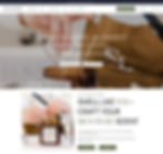
Home Page
Navigation Bar

The navigation bar was simplified and reorganized to reflect a more intuitive information architecture. Labels were clarified, and pathways to products and workshops were made more direct, improving user flow across the site.
Footer

We designed a clean, content-organized footer divided into About, Learn, Work With Us, and Help sections. This helped users quickly find support, partnerships, and brand information, a small but impactful improvement in the site’s overall accessibility.


Designed a dedicated block on the homepage to elevate the in-store candle-making experience
.
Added bold CTAs that drive users directly to booking, increasing awareness and engagement
.
Visual storytelling showcases the personal, hands-on nature of the experience.
Candle Bar
Experience Page

Introduced a content-first layout that explains what to expect in the workshop at a glance.
Added icons and short descriptors to make offerings like “group bookings” and “custom scents” instantly scannable.
Bundle discounts and benefits are clearly listed to encourage higher-value purchases.


Integrated booking into the website, replacing external redirects and simplifying the user journey
.
Added an intuitive calendar selector and reduced booking steps for faster completion
.
Bundle perks and group savings are placed near CTAs to aid decision-making and upsell tactfully.
Booking Page
Product Catalogue

Reorganized product grid with filters by scent, collection, and intention to enable guided browsing
.
Featured collections like “Top Picks” and “Seasonal Scents” help users explore more effortlessly
.
Product thumbnails now include scent notes and hover effects for richer micro-interactions.


Refined layout with clear scent descriptions, usage tips, and value reinforcement (e.g., eco-conscious packaging)
.
Added a dedicated Candle Care section to educate users and improve retention
.
Mobile-first layout ensures content is readable and actionable across devices.
Product Page
Impact
Measurable improvements in user experience and business metrics
+ Booking Clarity
Reduced drop - offs
+ Navigation Success
Better Tree Testing Results
Product Discovery
Improved Findability
User Feedback
Positive Response to New Design
Brand Values
Clear messaging on sustainability, craftsmanship, and intentionality reinforced Sea Love’s brand identity..

Candle Care Tips
Integrated directly on product pages to educate and empower customers while reinforcing product longevity.

Workshop Perks
Group discounts and first-time attendee highlights were added to encourage bookings and repeat visits.

Team: Aarushi Pohnerkar | Jordan McMorris | Keerthi Ginuga | Hazel Do
What did the Users say?

From Confusion to Confidence
Our redesign brought structure, serenity, and purpose to Sea Love’s digital experience. By streamlining the information architecture, clarifying navigation, and aligning the interface with the brand’s calming in-store essence, we transformed user confusion into confidence. The result: a more intuitive shopping and booking flow that empowers visitors to explore, create, and connect with ease and clarity.